Today:
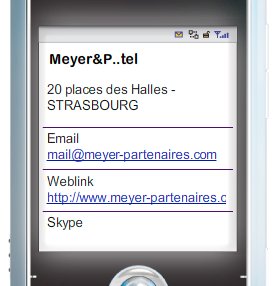
Tomorrow:

1) Background (5k)
2) Official logo (10k)
3) Splash picture (15k)
4) .tel data (comes from dns). click to call numbers etc
OK here's an example of what I think a .tel should look like, for blackberry / smartphone users (those are just ideas, far from perfect, but much more interesting that what we have right now). Of course if user has a crappy phone he should only see the boring version phone numbers etc (no graphics) but why penalize (and annoy!) the people who paid hundreds of dollars for theid BB, iPhone or HTC Touch? They expect more than a boring white page with a .tel logo which they have no idea what it means (and they actually don't care!)
This is just an idea of how an existing business (which is my favourite restaurant www.buonanotte.com) could look like only if people would open their mind and be allowed for creativity with the .tel platform. I think the idea of .tel was brilliant. However the execution of the strategy is many years behind what people are expecting from a mobile media in 2009.
Source:
http://telnic.org/forum/showthread.php?t=159
.







Keine Kommentare:
Kommentar veröffentlichen